Important to Understand
Before working with the config page, it’s important to understand that there is a divorce between the config page (and projects) and the running adapters config.
When you are using the config page, you are not editing live adapter config on the running adapter. You are editing a stored configuration xml file, which is either stored in the default ui store or saved on your local file system or saved on a remote version control system.
The config changes are not ‘made live’ until you apply them to a given running adapter.
When you navigate to the config page, it’s important to understand that it will always attempt to load the active adapters config (if only one adapter is registered with the ui) if you have this user preference set to true. If this is set to false, then the page will attempt to reopen the project you were working on (within the browser session). This is very important to understand, otherwise you may be editing config loaded from the running adapter rather than the project you are working on.
It’s recommended that if you indeed to use ui projects, that you turn the auto load user preference to false.
Getting Started
To navigate to the config page, you use the config button from the top navigation bar.
The header navigation bar:

The config page action:

Open/New Config
By default the config page will open the active Adapter if only one is configured in the application.
You can also open Adapter configurations from diverse sources. Just click on the Open Config button and that will open a modal displaying several options.
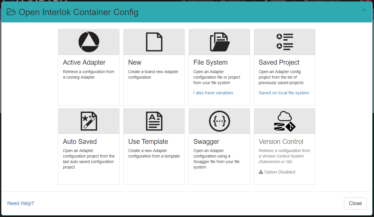
- Active Adapter: Retrieve a configuration from a running Adapter configured in the application.
- New: Create a brand new Adapter configuration.
- File System: Open an Adapter configuration file from your file system. It can be an adapter.xml file or a zip file (since 3.6.5). Click on the I also have variables link to Import an Adapter Configuration with variable properties. (since 3.7.0)
- Saved Project: Open an Adapter configuration project from the list of previously saved configuration projects. If the UI is run and accessed on localhost you will also see the link
Saved on local file systemwhich allows you to open an Interlok config project from your file system. The UI will prompt you to enter the local path of the project. - Auto Saved: Open an Adapter configuration from the last auto saved configuration.
- Use Template: Create a new Adapter configuration from a template.
- Swagger: Open an Adapter configuration using a Swagger file from your file system. Simple rest service swagger configuration (yaml or json) get converted to an adapter config with http jetty consumers. (Since 3.5.0)
- Version Control: Retrieve a configuration from a Version Control System (Subversion or Git). For this option to be enabled VCS needs to be configured and you need at least one VCS Profile.
Navigating the config page
Consider the following example of a typical config page:
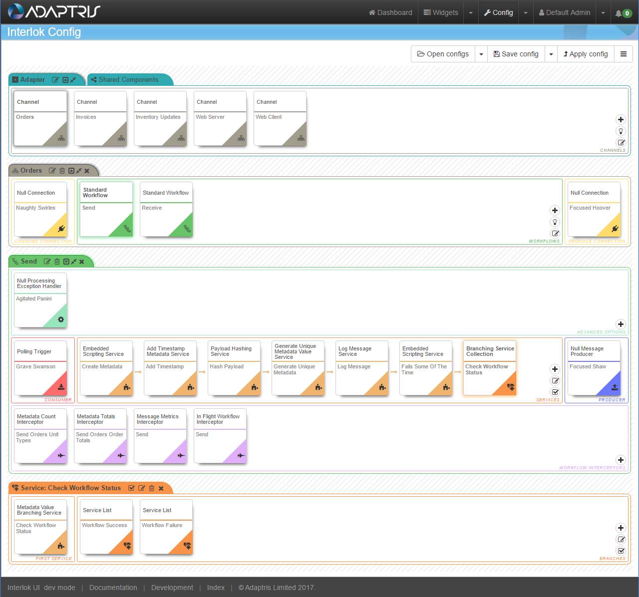
In this example, the config page is made up of the following sections:
- Header actions
- Container bar
- Shared Components area
- Channel area
- Workflow area
Header actions

This action bar is concerned with the (whole) config actions, such as opening a saved config, uploading a config file from your own store, and creating a new config file.
Container bar

This bar allows you to interact with the Interlok container; Select a channel; Add a channel; edit the container advanced options; edit the root settings for the Adapter object.
Shared Components area

You can add a connection or a service into the shared connection or shared service area and this connection will automatically becomes a shared one. You will be able to use shared components where appropriate by selecting it from the “Existing Shared Components” list.
Advanced components area

By clicking on the toggle button in the container title bar you will reveal the advanced extensions area.
Channel area

This area covers all your channel interaction requirements, from here, you can edit the channel settings, add workflows, select a workflow, etc.
Workflow area

This area covers all your workflow interaction requirements, this area allows you to edit the workflow settings, add/edit/delete/re-order services etc.
Component features
The following image shows an active component (a component that has the mouse hovering over it):

This component is a typical example and shows:
- Component type: This example is a com.adaptris.core.NullConnection, so the component type is a ‘Null Connection’.
- Component type icon: As this example is a connection, the connection icon is show.
- Id: This would display the contents of the ‘Unique ID’ setting for that component.
- Edit: Clicking this would display the settings editor for this component.
- Replace: Pressing this would perform a remove & add function, therefore allowing you to easily replace this component. In this example, pressing this would show the add connection modal window.
- Remove: Activating this function would remove the component from the configuration, i.e. deleting this connection.
- Copy: You can use this function to copy this component to the pages clipboard. You can hold 1 of each component type in the clipboard, which can then be used to Paste it to a given applicable area.
- Cut: As copy, but on a Paste command, this would remove the source component.
Delete component features
To delete a given component, you would click on the trash can icon  that’s either in the header bar of that components area or if you hover over a given component it will present itself. Clicking on the trash can would therefore remove that component from the config.
Add component features
To add a given component, you would click on the plus icon  , this will present itself when you hover over a list component, such as the channel list, workflow list, service list, etc.
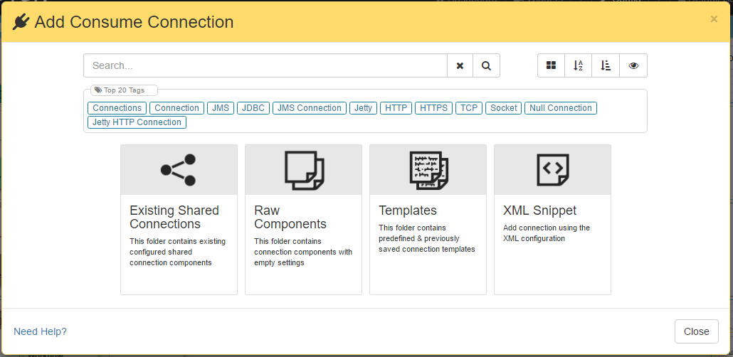
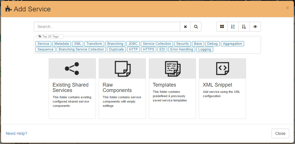
When adding a component, after clicking the plus icon, you’ll be presented with the add component modal window.
Example of a typical add component modal window:
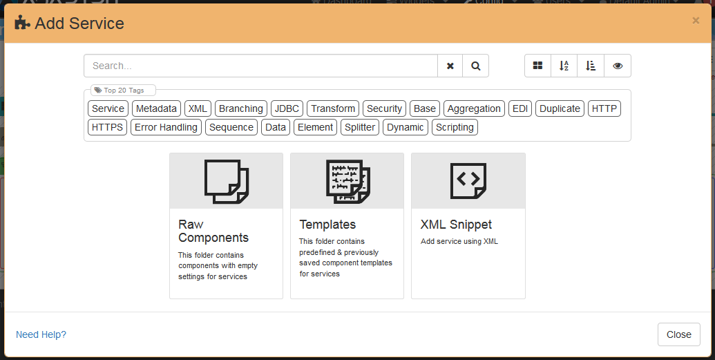
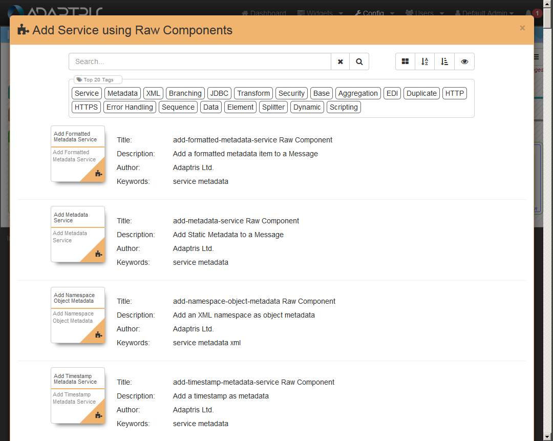
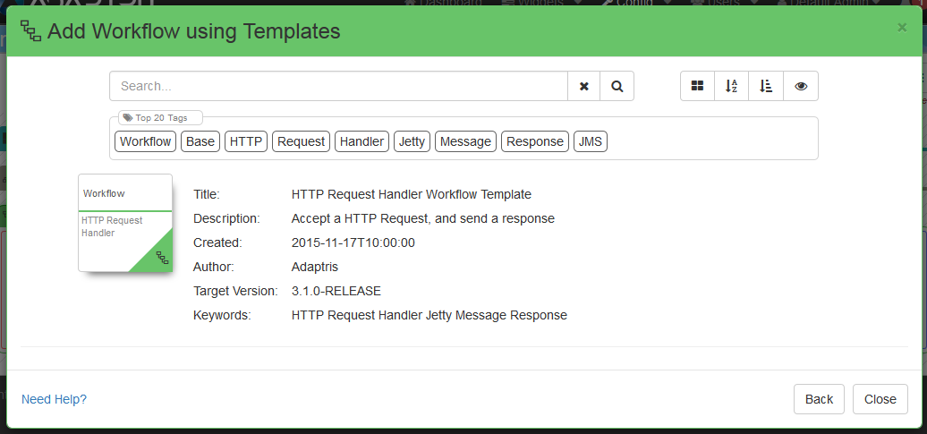
When the add component window opens, it always shows you the initial choice of ‘folders’, these are ‘Raw components’ or ‘Templates’. As their name suggests, the ‘Raw components’ folder contains a list of available components for that list, and selecting a component from this folder will add a component to the list with default settings configuring within it. The ‘Templates’ folder contains components that you have previously saved, using the ‘Save as template’ feature on the settings editor. You’ll notice that the window has a search input that can be used to filter components. This search can be used from the folder view (i.e. you don’t have to click raw compoennts and then search).
Example of a typical add component modal window after opening the raw components folder:
Example of a typical add component modal window after opening the template components folder:
Example of a typical add component modal window with results filtered using the search bar:
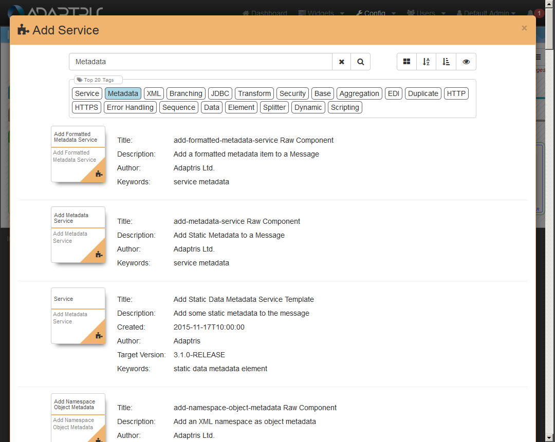
To actually add the component, all you have to do is click on the required compoent and it will add it to the list you selected and show you the settings editor for that new component.
Applying a configuration
To apply the current config to a running adapter you will simply need to click on the Apply Config button from the header action bar. 
This will open a modal where you can select which adapter you want to apply the config to and, optionally, which variable set you want to use for this adapter.
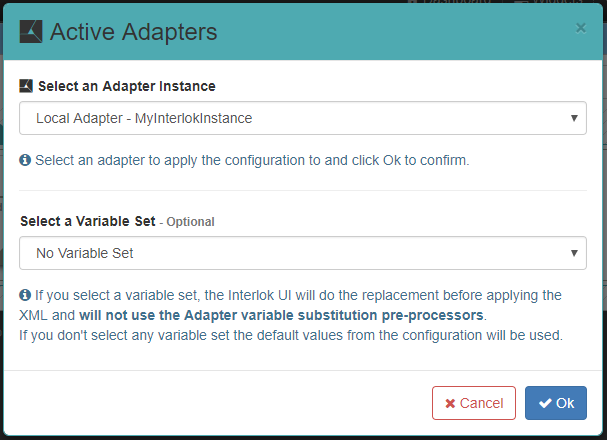
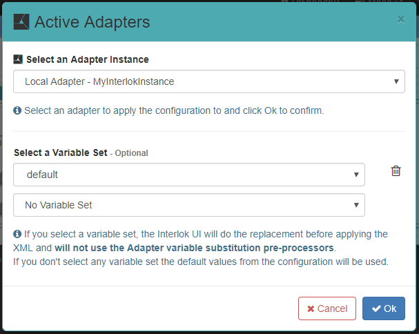
You can also apply the config with multiple variable sets. When more than one variable set have the same property the latest will take precedence.
Then you just need to click on Ok and the apply process will start. Another modal will be displayed to show you the status of each step of the apply process.
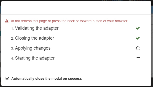
If there is any error during the process they will be displayed in the main page.
Settings editor features
The settings editor is available when you want to edit a component. This is always available by clicking on the edit icon  . This editor allows you to edit the settings on a given component.
Example of a typical settings editor:
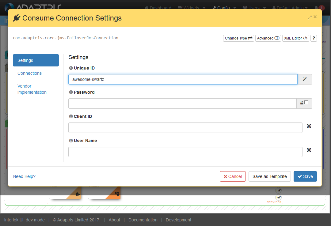
You will notice that there is a input control per field for that given component. Next to the field name, there is an info icon, which if you hover over this, that fields javadoc part with show. As well as the inline help, if you click on the info icon that’s in the settings editor header, this will open a new browser window with that component type javadoc.
As well as text inputs and radio inputs, there is also implementation selectors; the editor showing implementation selection:
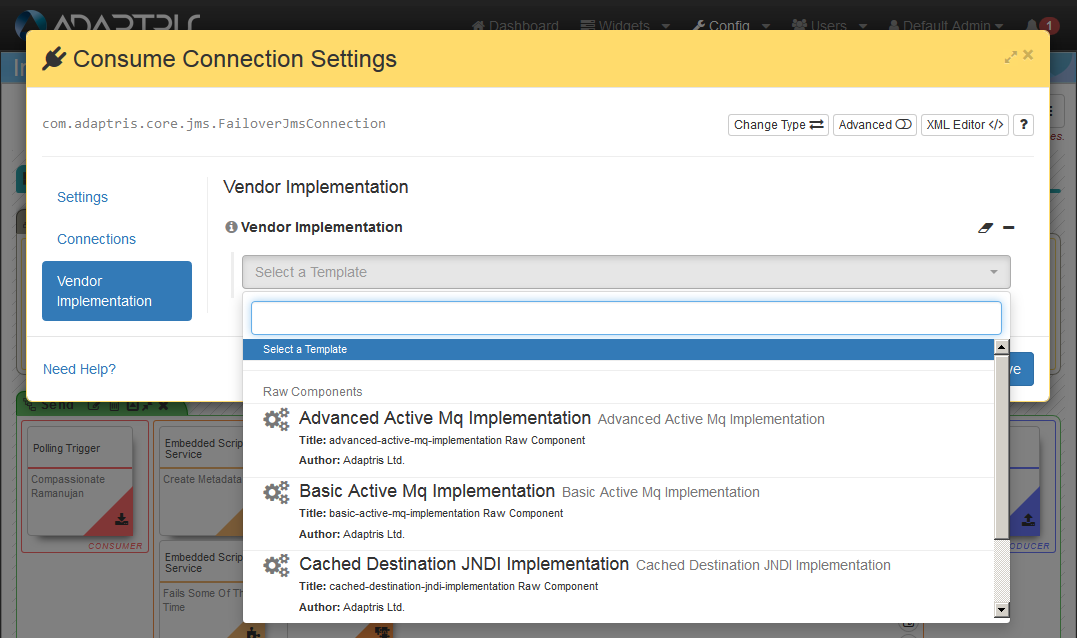
This will allow you to select a given implementation for that field, this is handy if you need to select an error handler type for example.
As well as string, number and boolean inputs, there are special inputs for SQL, XML, Script, etc, that allow better editting of those values.
Example of a typical settings editor with a script input:
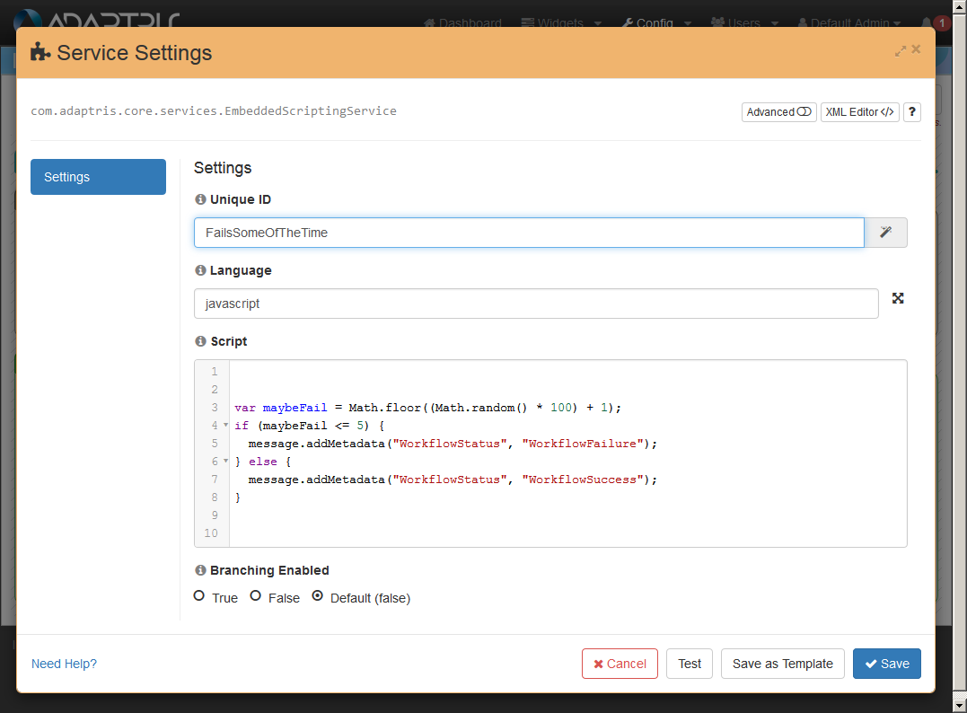
As well as allowing you to easily edit the values of a component, if you do want to switch to the advanced XML config mode, then you would press the XML icon in the editors header  .
.
Example of a typical settings editor in XML mode:
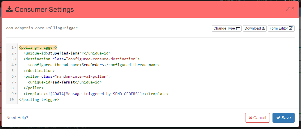
The following image shows an annotated settings editor:
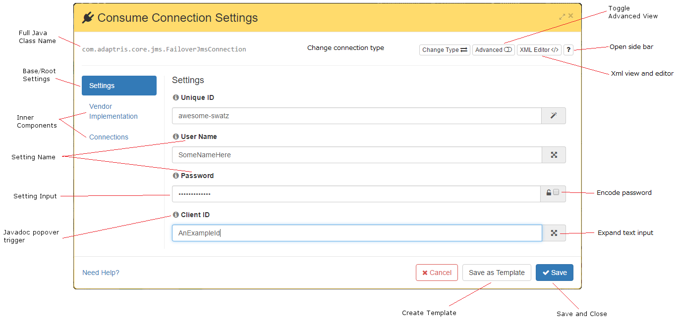
This editor is a typical example and shows:
- Full Java Class Name: This is the full java package & class name of the component that is being edited.
- Base/Root Settings: Each component is made up of its settings and its inner components, so this ‘tab’ will show the root settings for this compoenent.
- Inner Components: There would typically be a ‘tab’ per inner component. This example shows that outside the root settings, we have connections, and a vender implentation.
- Setting Name & Setting Input: Each of the components settings (and inner components settings) will have a list of configurable fields, made up of the setting label and the setting value.
- Javadoc popover trigger: Hovering over this icon with your mouse will show that fields javadoc part.
- Encode password: This is a password only feature, but ticking this would encode that feilds value in the XML.
- Expand input: Each text input will have the option to expand the input from a single line to a text area (for multiple line input).
- Change connection type: This button allows you to switch the component type, for example if you had a FTP Connection, you could switch types to a JMS Connection (or any other connection). This feature will change the base type of the component and attempt to copy any matching field values.
- Expand window: Clicking this will toggle the settings editor window size.
- Toggle Advanced View: Switching on the advanced view shows all the fields for the given component including all those fields that can be safely left to their defaults.
- Open side bar: This button opens a side bar in the modal that will offer several options:
- Help : Which supplies some basic information / links to help you edit the component
- Test Compontent : Allows you to test the output of a component
- Metadata Preview : This panel will list any metadata used by the selected Workflow
- Most Occurences : This is a list of values that have been used the most in the current config
- XML view and editor: Switch to the advanced XML config mode
- Save and close: Save your changes and close the editor.
- Create Template: Create a template from this configured component, which will then be shown as a choice during the add component feature.
Settings editor sidebar
Since 3.5.0, the config settings editor has a useful sidebar. Shown in this video:
Since 3.7.0 you can use the sidebar to encode some setting values using the URL Encoder. To do that, select URL Encoder in the sidebar dropdown, enter the value you want to encode and click on the Encode button.
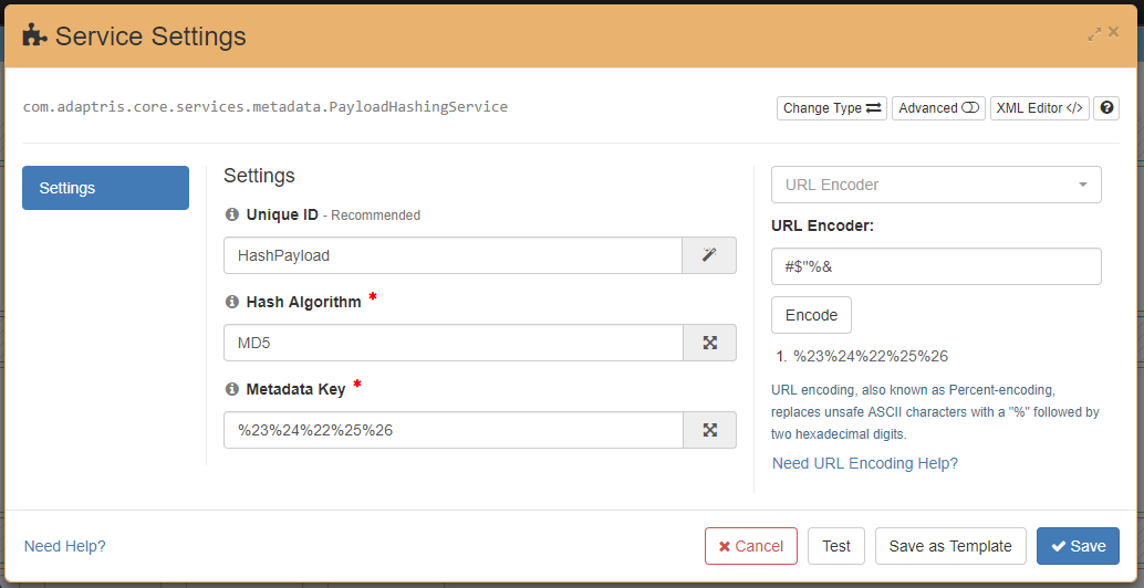
The sidebar keep an history of the last ten encoded values while you stay on the config page. You can drag and drop the encoded values to any text input on a similar way as with the Metadata Preview and the Most Occurrences shown in the video above.
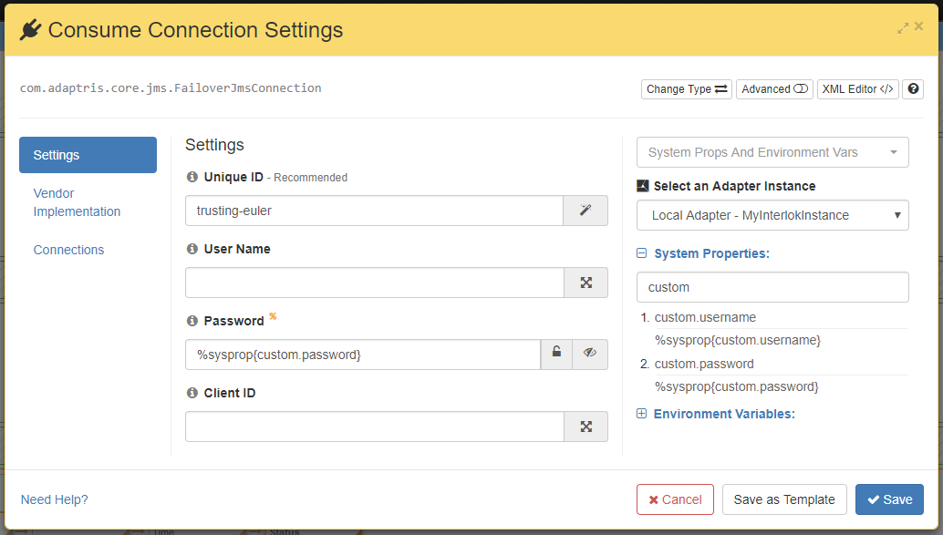
Since 3.7.1 you can use the sidebar to retrieve system properties for the selected running adapter. You can drag and drop the system properties in the text field which allow External (System Propertiess, Environment Variables), they are marked with the orange ‘%’.
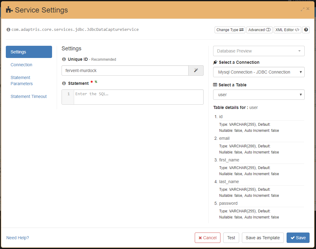
Since 3.7.2 you can use the sidebar to connect to a database using a configured connection and retrieve the list of tables and their columns details. You can drag and drop the table and column names in text fields.
Navigating service collections within components
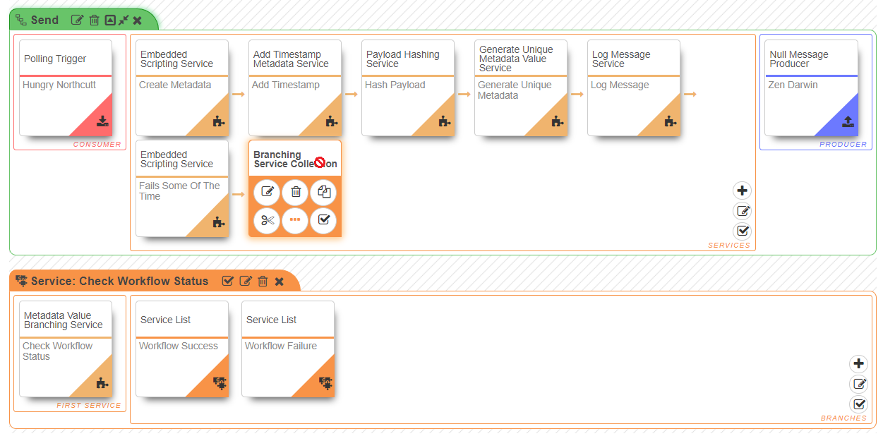
In the follow example, a service contains its own service list which also contains its own service list:
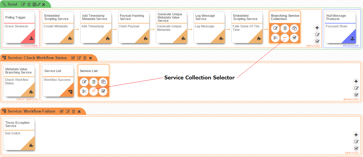
These service lists wouldn’t be shown in the settings editor. Instead they are selectable by clicking on the service collection selector icon on the component visible on hover (see above). This then brings up a service collection area which can be operated on in the same manner as the workflows service list area.
Drag and Drop
Services, service collections and connections are the only components in the config page which can be drag and drop.
- Drag and drop a service in the same service collections will re-order the service.
- Drag and drop a service in a different service collection will move the service to a different service collection.
- Drag and drop a service from a service collection to the shared service collection will create a new shared service in the shared components and use this new shared service in the original service collection.
- Drag and drop a service from the shared service collection to any other service collection will add the shared service to the *service collection.
- Drag and drop a connection from a channel connection area to the shared connection collection will create a new shared connection in the shared components and use this new shared connection in the original channel connection area.
- Drag and drop a connection from the shared connection collection to any channel connection area will add the shared connection to the *channel connection area.
