After an initial login, the Dashboard page will show you the auto-discovered local Adapter component.
A typical dashboard page with a single Adapter registered to it. In this example, the Adapter was auto-detected:

The Adapter Area
The Dashboard Page with annotations shows the various parts of the Dashboard Page:

- A. This is the registered Adapter Component, there would be one of these areas displayed per registered Adapter;
- B. The Adapter Status, which is represented by:
| Icon | Description | Meaning |
|---|---|---|
 |
orange banned signal | the Adapter is closed |
 |
orange no entry signal | the Adapter has stopped |
 |
red cross | an error occurred |
 |
black circle | the Adapter has the initialised status |
 |
unlinked blue icon | disconnected (unreachable) |
- C. The current Heap Memory for this Adapter indicated by a gauge; (Since 3.3)
- D. The number of started channels is indicated by a gauge;
- E. The number of failed messages is indicated by a number on a red badge. If the number is 0 the badge will be green. You can click on this block to get the list of failed messages;
- F. The number of in flight messages (message being processed) for the Adapter. (Since 3.3)
- G. This indicates the Adapters last started time and up time if the Adapter is started or the last stopped time and down time if the Adapter has stopped;
- H. This would be the name of the Adapter;
- I. That Adapters JMX Service URL;
- J. The Show Channels checkbox feature will display a list of Channel components with further channel related information;
- K. This is the Adapter Control Bar, which contains various functions that can be performed on the Adapter:
| Button | Meaning |
|---|---|
 |
Show the Adapter Information (Version, Java and OS) |
 |
Show the Adapter configuration (xml and diagram) |
 |
Edit the Adapter configuration (in the config page) |
 |
Start the Adapter |
 |
Pause this Adapter from processing messages and allow it to retain any connections it has already initialised |
 |
Stop this Adapter and free up any resources that it has used |
 |
Under the Stop dropdown. Force Stop this Adapter (doesn’t wait for services to finish) and free up any resources that it has used. |
| Under the Stop dropdown. Request a Java Garbage Collection on the Adapter | |
 |
Under the Stop dropdown. Generate a thread dump on the Adapter |
 |
Under the Stop dropdown. Reload this Adapter configuration from Vcs and restart it. Only available for User and Admin users and if version control is configured for this Adapter. (Since 3.3) |
 |
Under the Stop dropdown. Download a support pack containing log files and information about this Adapter. (Since 3.3) |
 |
Under the Stop dropdown. Edit and Adapter name or tags. (Since 3.7.3) |
 |
Refresh the Adapter status and details |
 |
Remove the Adapter from the dashboard page |
- L. This area is for ‘top level’ functions, i.e. Add another Adapter to the UI, Refresh all the details on the Dashboard Page for all the Registered Adapters or Switch between the Widget and Table mode.
The Channel Area
Ticking the Show Channels checkbox in the Adapter control bar will expand the Adapter area and show a list of its Channel components.
Dashboard Page with the Show Channels selector highlighted in pink:

The Dashboard Pages Adapter area with expanded channels showing with annotations:
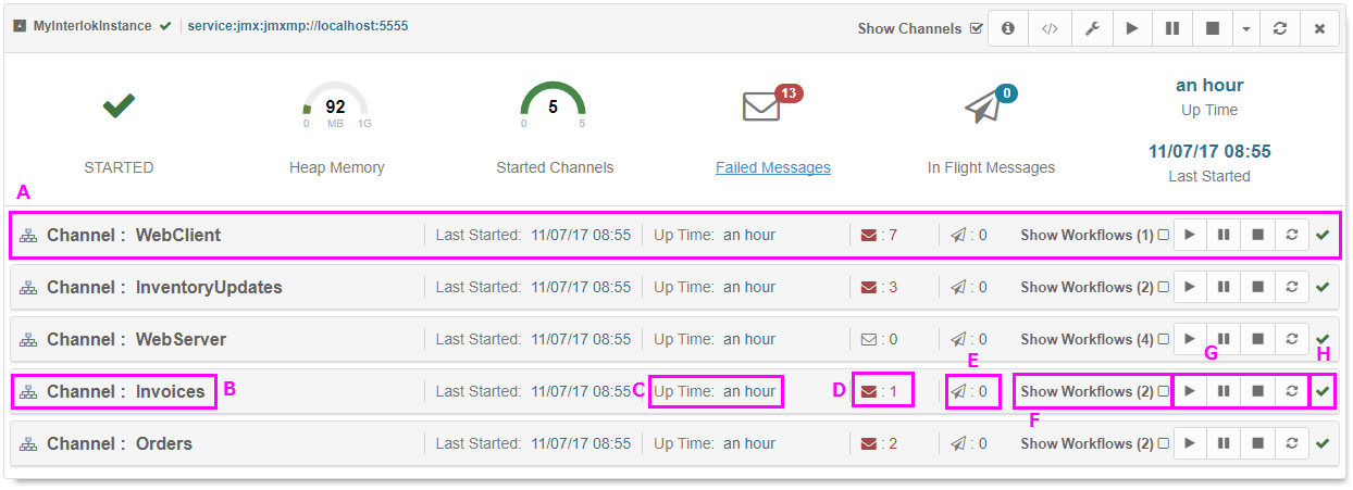
- A. Channel component
- B. Name: The Channel unique Id used in the adapter configuration.
- C. Up/Down Time: This indicate the Channel up time if the Channel is started or the down time if the Channel is stopped.
- D. Failed Messages: The number of failed messages is indicated by a red number next to a red envelope. If the number is 0 the envelope will be grey and the number green.
- E. In flight messages: The number of in flight messages (message being processed) for this Channel. (Since 3.3)
- F. The Show Workflow Control: Allows a user to view the selected channels workflows
- G. The control bar: Allows a user to perform several actions on the Channel, such as start, stop and refresh status
| Button | Meaning |
|---|---|
 |
Start the Channel |
 |
Pause this Channel from processing messages and allow it to retain any connections it has already initialised |
 |
Stop this Channel and free up any resources that it has used |
 |
Refresh the Channel status and details |
- H. Status: The status is represented by:
| Icon | Desc. | Meaning |
|---|---|---|
 |
green tick | the Channel is started |
 |
orange banned signal | the Channel is closed |
 |
orange no entry signal | the Channel has stopped |
 |
red cross | an error occurred |
 |
black circle | the Channel has the initialised status |
The Workflow Area
Ticking the Show Workflows checkbox in the Channel control bar will expand the area and show a list of its Workflow components.
The Dashboard Page with Workflows expanded:
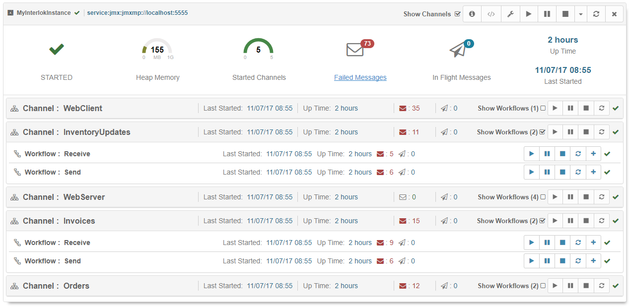
A Channel areas expanded Workflow area:

The Workflow component is split in five parts:
- Name: The Workflow unique Id used in the adapter configuration.
- Last Started/Stopped: The Workflow last started time is indicated if the Workflow is started otherwise the last stopped time is indicated it the Workflow is stopped.
- Up/Down Time: This indicate the Workflow up time if the Workflow is started or the down time if the Workflow is stopped.
- Failed Messages: The number of failed messages is indicated by a red number next to a red envelope. If the number is 0 the envelope will be grey and the number green.
- In flight messages: The number of in flight messages (message being processed) for this Workflow. (Since 3.3)
- The control bar: Allows a user to perform several actions on the Workflow.
| Button | Meaning |
|---|---|
 |
Start the Workflow |
 |
Pause this Workflow from processing messages and allow it to retain any connections it has already initialised |
 |
Stop this Workflow and free up any resources that it has used |
 |
Refresh the Workflow status and details |
 |
Toggle the list of the Workflow Services |
- Status: The status is represented by:
| Icon | Desc. | Meaning |
|---|---|---|
 |
green tick | the Workflow is started |
 |
orange banned signal | the Workflow is closed |
 |
orange no entry signal | the Workflow has stopped |
 |
red cross | an error occurred |
 |
black circle | the Workflow has the initialised status |
The Dashboard on Smaller Screens
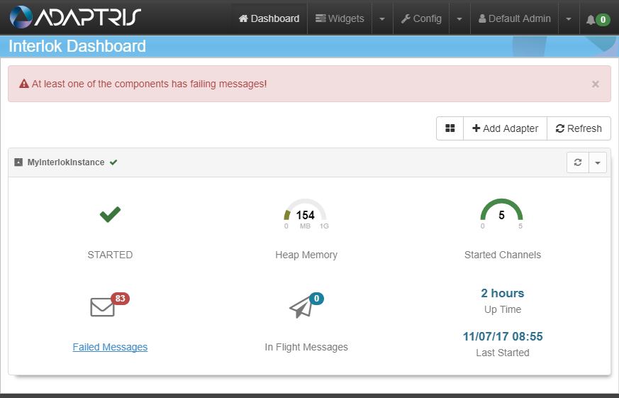
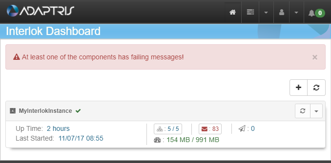
As with all the pages in the Interlok UI, on smaller screens, such as a tablet, the page will display slightly differently, to make best use of the smaller size constraints.
Examples follow:
Dashboard Page shown on a small screen:
Dashboard Page shown on a smaller screen:
The Dashboard Show Config Feature
On the Dashboard page, clicking on the Adapters ‘Show Config’ button will open a modal window containing the Adapter configuration. This is presented in two different formats, XML and Diagram modes; The XML mode is a read-only display of the Adapter configuration in a formatted XML display. The Diagram mode is a visual representation of the Adapter configuration.
Dashboard Page with the show Config button highlighted in pink:

After pressing the Show Config button, the Config modal window will appear.
Dashboard Page with the Adapter Config modal showing on the XML view:
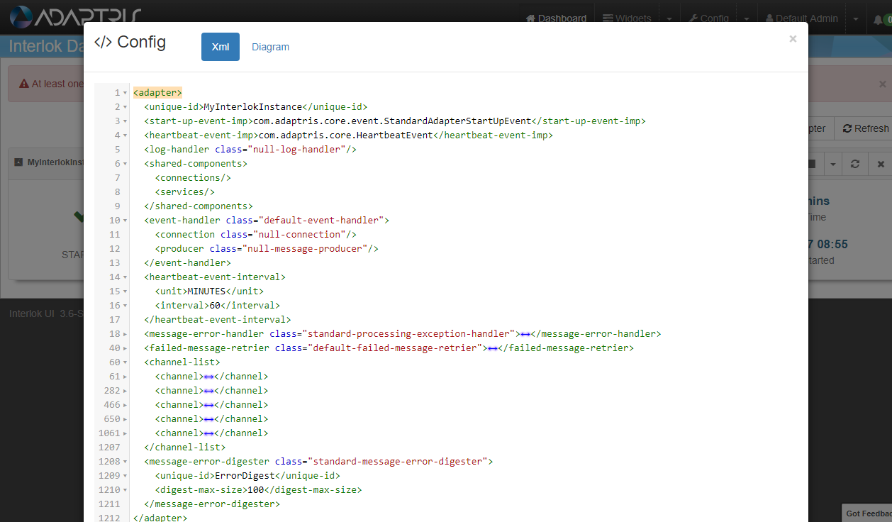
Shown above is the view that appears after pressing the Show Config button, the Config modal window will appear and the XML view will be shown as default. In this view users are able to collapse and expand XML elements. This is a read only view of the XML config, and any changes made here would not be applied to that Adapter.
Using the diagram button on the top of the config modal will present the user with visual representation of the Adapter configuration.
Dashboard Page with the Adapter Config modal showing on the Diagram view:
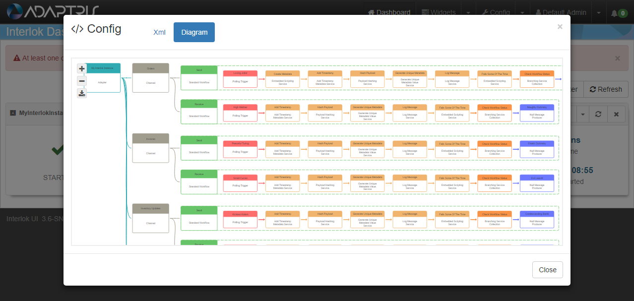
On the visual representation of the Adapter configuration, the following options available:
- Zoom into the generated diagram
- Zoom out of the generated diagram
- Present a downloadable version of the diagram. This function will open a new window with the full image that the user can save locally.
- The mouse wheel can also be used to zoom in and out of the diagram
- The mouse left button can be clicked and held to allow users to navigate around the zoomed in diagram.
Not every component is shown in this simplified diagram, notable absentees include Workflow Interceptors and Service Collections within a Workflows Service List.
The Dashboard Failed Message List
On the Dashboard Page, if any of the registered Adapters have failed messages, then a disposable alert is shown to warn the user.
Dashboard Page showing failed messages:
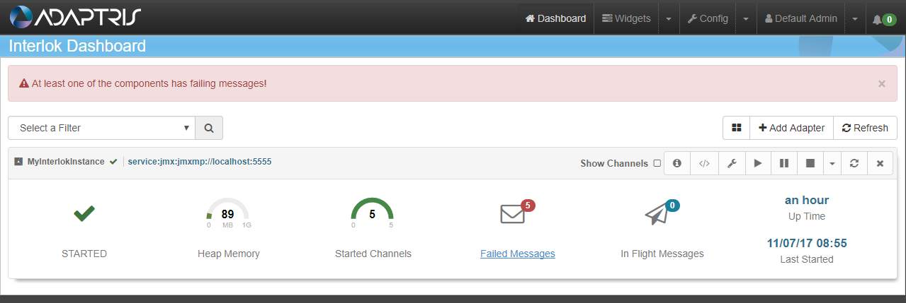
In order to get the number of failed message working a ‘Standard Message Error Digester’ will need to be added to the adapter configuration.
Clicking on the Failed Messages details block will open the Failed Messages modal window containing the last hundred failed messages.
Dashboard Page with the clickable Failed Messages area highlighted in pink:

The Dashboard Pages Failed Messages modal window:
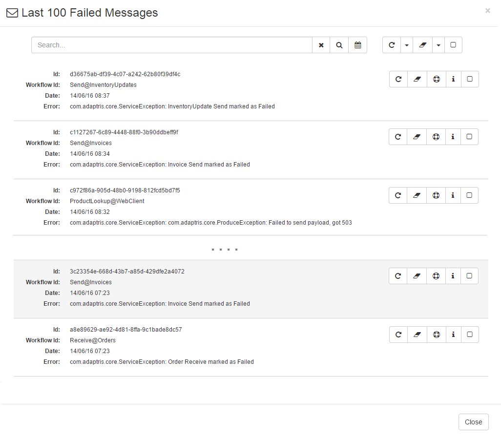
The above image shows a typical Failed Messages modal window page with a handful of failed messages.
The Dashboard Pages Failed Messages modal window with annotations:
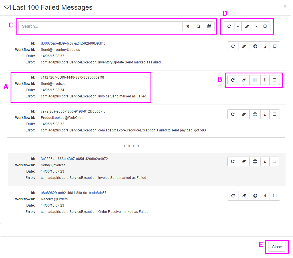
The above image shows the various parts of the Failed Messages modal window:
- A. This is a summary of a failed message, detailing the message id, the workflow id of where the message failed, the date of the failure and any error messages that were generated upon the failure of the message;
- B. This is the failed message control functions:
- Retry the failed message.
- Ignore the failed message; this will remove the message from the UI failed messages list, without retrying it.
- Create a support pack; this will create and download a zip file with some information about the adapter and the failing message. (Since 3.3)
- Show more information; this will display the full stack trace of the failing message and the logs traced at the time the message failed. (Since 3.3)
- Select the failed message; this will be used when using the deleting/retrying all selected message buttons. (Since 3.5.1)
- C. This is the Search Failed Message List feature that includes a free text input, whose value will be used to filter the failed message list. The buttons alongside this input are for clearing the filter, executing the search and selecting the date range respectively;
- D. These commands operate in the same fashion as those in the failed message control functions (detailed in point B), but these operations relate to all the messages displayed in the failed message list (i.e. if you are using the search filter, the actions will only be applied to the displayed messages);
- E. This button can be used to Failed Message modal window.
Add Adapters To The Dashboard
If the local Adapter is not shown (e.g. previously removed) or if a user wishes to monitor another Adapter, the Add Container button of the Dashboard page can be used.
Dashboard Page with the Add Adapter button highlighted in pink:

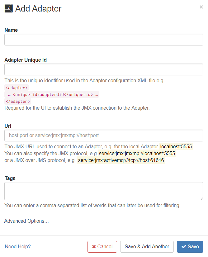
Clicking on the Add Container button will open the Add Adapter modal window which contains a form that allows you to register an Adapter to the UI.
The Dashboard Pages Add Adapter modal window:
The Dashboard Pages Add Adapter modal window with expanded advanced options:
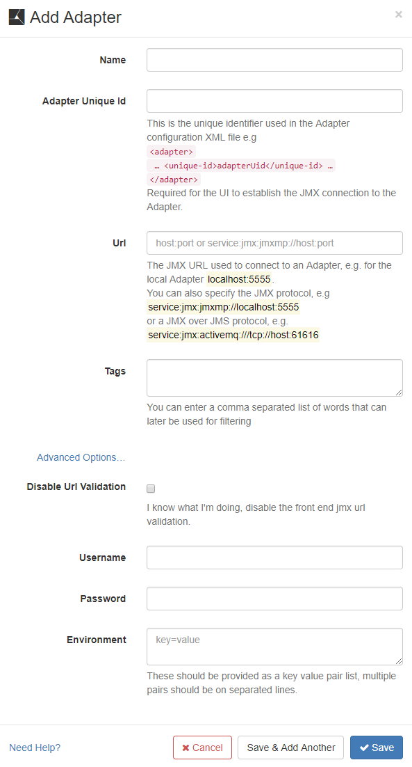
The Add Adapter form inputs explained:
- Name: This property is for display purposes and also an easy way to differentiate Adapters registered within the UI web application.
- Adapter Unique Id: This is the Adapter unique identifier used in the Adapter configuration XML file:
<adapter><unique-id>adapterUid</unique-id</adapter>. This is required for the UI to establish the JMX connection to the Adapter. - URL: The JMX URL used to connect to the Adapter, for example: localhost:5555. You can also provide the JMX protocol: service:jmx:jmxmp://localhost:5555
- Tags: The tags associated to the Adapter to make it easier to filter Adapters. (Since 3.7.3)
- Advanced Options - Clicking the Advanced Options link will unveil three more properties, all of which are optional :
- Disable Url Validation: This options disable the JMX URL front-end validation. It should be use with care and only if you know that the JMX URL you are using is valid but fails validation (Since 3.6.5)
- Username: The username needed to establish the JMX connection if you are using password protection for the adapter JMX connection as describe in Password Protecting JMXMP (Since 3.1.1)
- Password: The password needed to establish the JMX connection if you are using password protection for the adapter JMX connection as describe in Password Protecting JMXMP (Since 3.1.1)
- Environment: Some environment properties needed for the JMX connection. These should be provided as a key value pair list (multiple pairs should be on separated lines), for example: javax.net.ssl.trustStore=/tmp/myStrustsore
Adding more than one Adapter will result in having a list of Adapter components listed on the Dashboard Page.
The Dashboard Page with multiple registered Adapter instances:
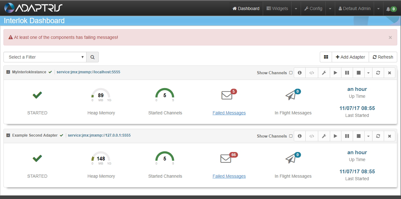
Table Mode
Since 3.7.3 the dashboard page can display the Adapters in a table mode. This new mode make it easier to monitor several Adapters.
To switch between the two modes just use the toggle button next to the “Add Adapter” button 
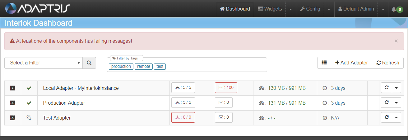
Since 3.7.3 when creating an Adapter you can also add one or many tags that can be used for filtering. If at least one Adapter has a tag the tag list will be displayed above the Adapter list or table.

